The more we need a website, the more we’re prepared to put up with a poor design.
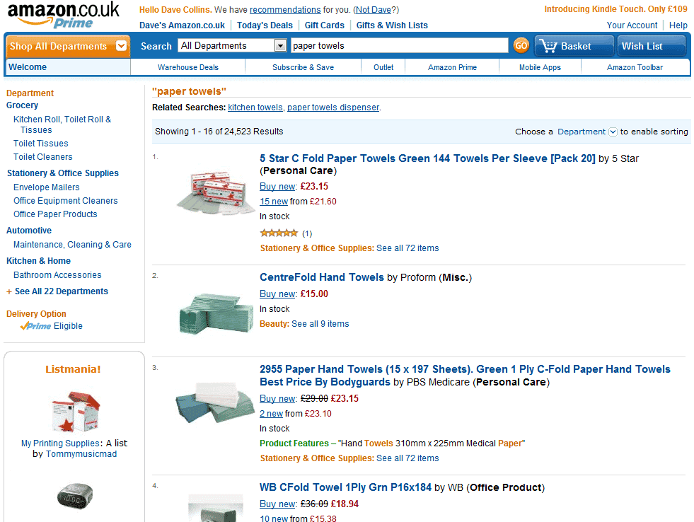
Amazon’s layout is famously basic but effective. Consider the following after a search for paper towels:
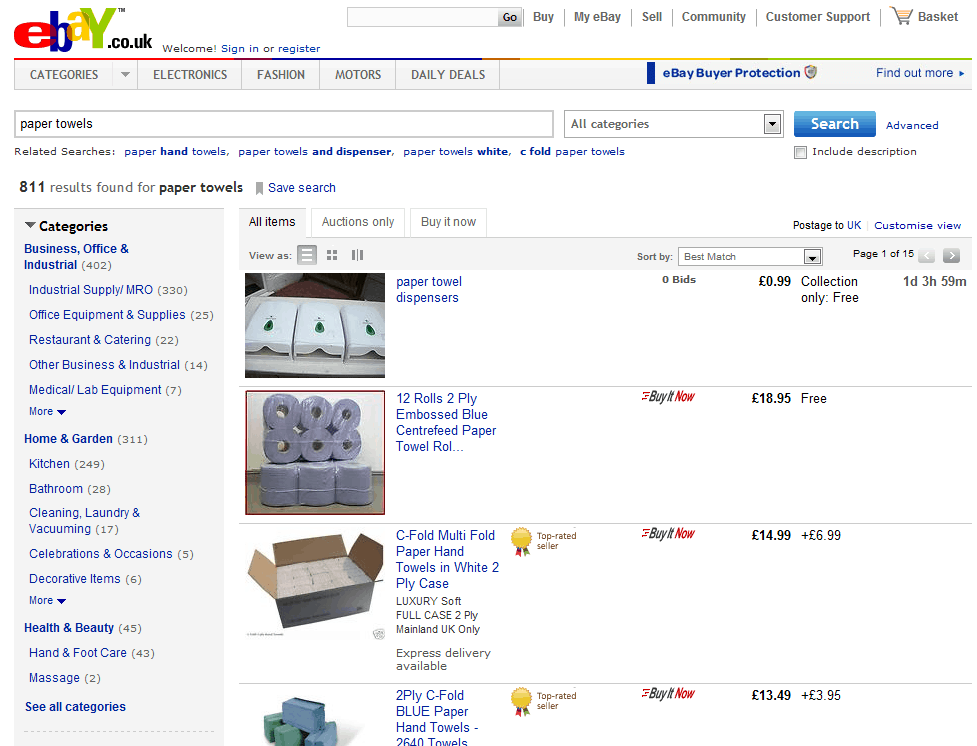
And the appearance of the results for the same search on eBay also won’t be winning any design awards:
Amazon and eBay both offer clear and tangible benefits to their users, and so in a sense don’t need to develop the appearance of their websites.
Amazon seem instead to devote their efforts to cross-selling and upselling, while eBay offer more great (and safe) deals than any other website.
Which is why they can get away with ugliness and a dated design.
Yet both websites offer a far prettier front end. Both sites have better-designed and more attractive home pages.
If you rely on your website to impress visitors and turn them into customers, then an ugly interface and design simply won’t do it.
Unique ideas for your business
The Demystifier puts practical ideas into your hands. You won't find them elsewhere. Original, actionable and insanely effective.


