The “picture is worth a thousand words” often seems to be taken a little too literally.
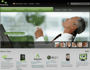
Take the main page of the Nuance UK website:
The image is striking, but conveys nothing. And the text overlay does little by the way of clarification.
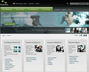
A click on the Learn More About Nuance button takes me to the following page:
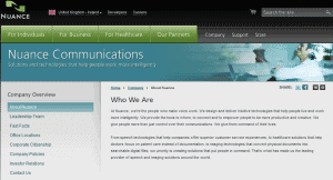
Another person with their head thrown back, but I’m still no clearer, so I click on the Learn More button again:
The images on these pages serve no purpose, aside from adding some colour.
Images employed on your website need to either convey relevant information or entice your visitors to act.
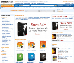
By way of example, Amazon’s own graphics and visuals are almost non-existent. The visitor is instead bombarded by images of the products that they sell, and nothing more.
Research demonstrates that our eyes are initially drawn to the images on a web page. So why not go for something more productive than eye candy?
PS: You might find our own Website Teardown service useful – have an independent expert give you detailed and user-realistic impression of your current website setup.
Unique ideas for your business
The Demystifier puts practical ideas into your hands. You won't find them elsewhere. Original, actionable and insanely effective.


