In the beginning, there were lots of search engines.
Our SEO service used to optimise client websites for AltaVista, Yahoo, InfoSeek, Lycos and others. Each of which had their own priorities and methodologies. Great fun.
Then came Google, and that was more or less that.
As an early adopter of Google, I found it interesting that the very issue that initially put people off the new search engine was in time to become to become one of its main strengths:
Simplicity. A minimalist design with no images, no clutter, and plenty of white space.
Until now.
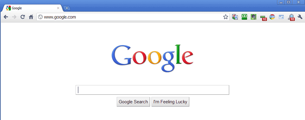
When you arrive at Google, for just a second or two, you’re given the barest of pages. A logo, a text entry box and two buttons:
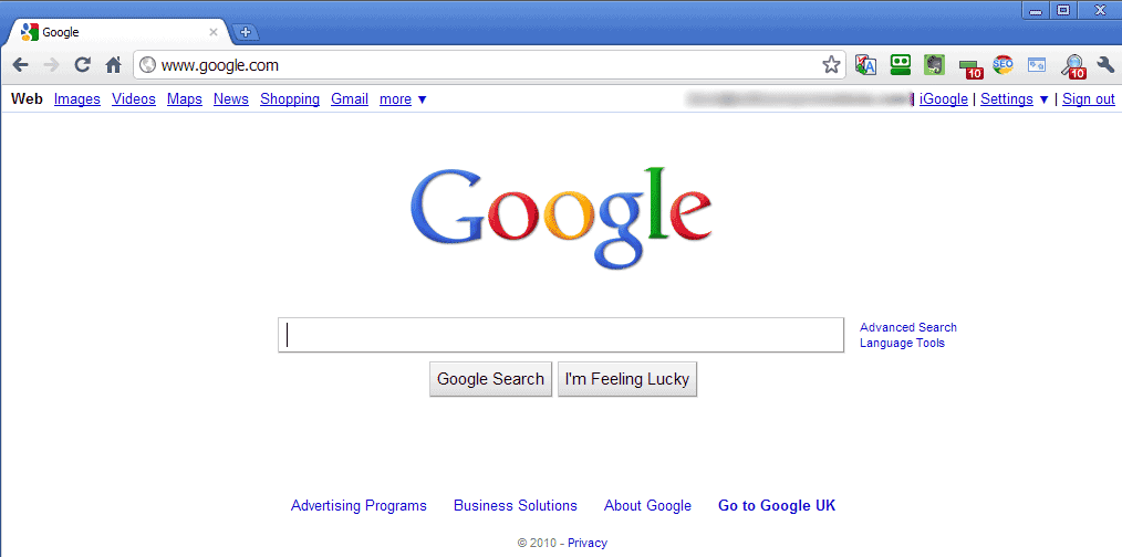
A moment later, the main navigation comes in:
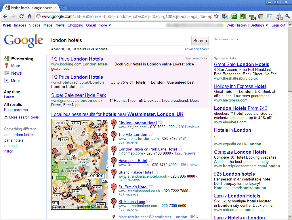
At this point it’s still fairly sparse, but when I enter my search phrase and click on Google Search, that all changes:
Note that the resolution used was 1024 x 768, so as to minimise the size of the screenshots. But that’s still a reasonably-sized resolution, and still in use by a lot of systems.
What happened to all the white space? Why do we have two navigation elements – some of which use the same links?
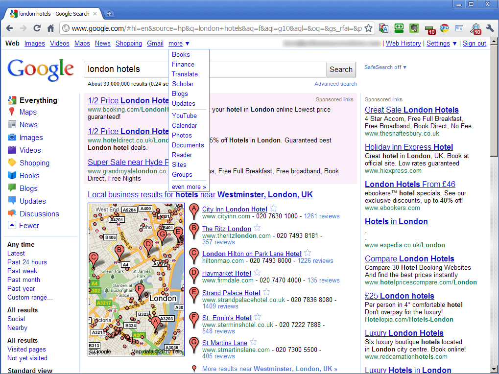
And when you expand the navs, it gets much worse:
At this point I can see more than 40 different navigation links that I can click on without scrolling my mouse.
So what’s going on?
It looks as though Google are testing new ideas, and I would assume that in time they’ll settle on one approach or the other. The formatting of the top link to images, for example, is quite different from the formatting of the left hand side link.
But the fact remains that Google’s interface is not as clean as it once was.
Feature bloat is a term used to describe the inevitable change that sees a tightly focused and simple version 1 of a software application become a massive, over-packed version 4.
It looks as though Google may be going the same way. For now at least.
Unique ideas for your business
The Demystifier puts practical ideas into your hands. You won't find them elsewhere. Original, actionable and insanely effective.


