Mistakes on your website result in lost sales and lost customers.
Your website is making at least four out of five of these mistakes right now.
(1) Not understanding the problem.
Everyone who comes to your website has a problem that needs fixing.
Showing them that you understand their problem convinces them to stay longer.
Showing them that you can solve their problem turns them into a customer.
(2) Too much information.
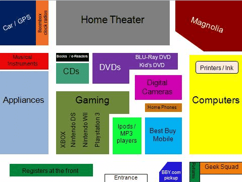
When you walk into a large store there will often be some sort of map or chart showing where to go for different product types or ranges.
You won’t see a list of every single product on sale.
(3) Attention dilution.
A well designed website page steers the visitor towards the pages you want them to see.
Links are choices. The more you provide, the more you overwhelm.
(4) Hurdles that hurt.
There are so many obstacles that you can place between your customer and receiving their money.
Mandatory registration for a trial, internationally-unfriendly forms, enforced plugins, asking for too much data, phone-only sales process, voucher codes that don’t work and more.
All purchases require a minimal amount of time investment.
Go beyond minimal and it becomes a nuisance. Beyond a nuisance becomes painful.
How much pain will your customers tolerate before walking away?
(5) Thinking they care.
Your visitors don’t care about your company goals, your vision, the thought-process behind your website, your hamsters, your company’s environmental concerns, or your life story.
Or rather they don’t care about any of these things when they arrive at your website.
They care about their problem. See point 1.
Unique ideas for your business
The Demystifier puts practical ideas into your hands. You won't find them elsewhere. Original, actionable and insanely effective.


