Our company has worked with a lot of different applications over the years, and I usually recognise a good application when I see one.
When first evaluating an application, one of the first things the user notices is the interface. Most Windows applications use a similar convention. They have a row of menu items that make use of dropdown menus, a row or two of icons, and then the main application window itself.
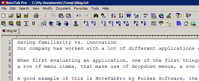
A good example of this is NoteTabPro by Fookes Software, the tool I use to write my daily blog posts.
The top menu is familiar, and even though many of the icons are unique to the software, most people will still recognise new, open, save, print, undo/redo and the spell checker.
The reason that so many applications use a similar interface is familiarity. Even if you’d never seen or used NoteTabPro before, you could at least start using the basic functionality immediately.
However this standardised look is getting more than a little dated. For instance have you ever noticed the standard save icon?
When’s the last time you used (or even saw) a floppy disk? And how many computer users are there who have never seen a floppy disk at all?
Going for a completely new and different interface, however, is a risky undertaking.
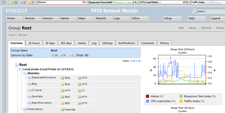
Some applications have no need of the Windows standard look and feel, so a different interface can make perfect sense, for example PRTG by Paessler:
And some applications have embraced a completely new look and feel, bravely ignoring the criticism by the masses. Microsoft’s Office 2007 is the obvious example that springs to mind – their Ribbon attracted a lot of criticism and little by the way of praise:
I myself use Office 2007 on a daily basis, and was an early adopter when it came out, yet I still don’t like the Ribbon, and it still takes me longer to find my way round their interface. And I know I’m not alone – there’s even commercial software that will show the “classic menus and toolbars” within Office 2007.
So how does the software developer get the balance right?
If your software can work within the confines of the existing standards, then why reinvent the wheel for the sake of it? Do so, and you risk confusing existing users and dissuading potential customers – not a good idea for most software companies.
If, however, your software needs a new interface, for reasons of functionality, then make sure you get it right. Paessler did so, but Microsoft didn’t. And it’s worth noting that Microsoft are still using the floppy disk icon for their Save function.
Unique ideas for your business
The Demystifier puts practical ideas into your hands. You won't find them elsewhere. Original, actionable and insanely effective.


