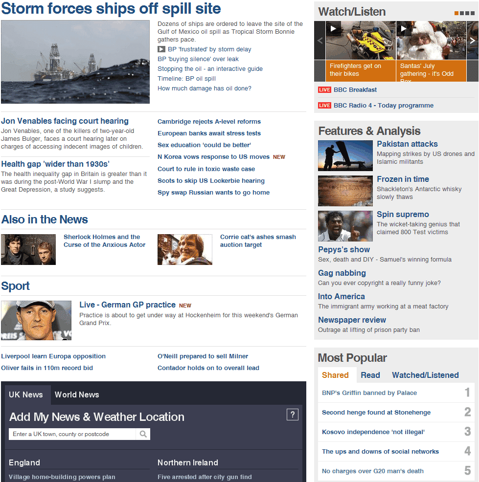
As a very regular user of the BBC news website, and someone who works with website optimisation and usability, I was geekishly excited when I heard that the BBC were in the process of a major redesign. Yet what a disappointment!
The preview certainly sounded good:
• a fresh, updated design, with more space for the main stories of the day
• better use of video and images
• clearer and more prominent labelling and signposting of key stories, whether you are on the front page or a story page
• a better indication of which are the most recent headlines
• easier ways to share stories with others, for those who wish to, on social media networks
The reality, however, is a major disappointment.
Take a look at how the top navigation appears in Chrome – note that the size has not been reduced; it really is that unclear:
Then there’s the bewildering mix of fonts, sizes and styles:
I understand that when a regularly used website is updated, users tend to initially dislike the redesign. But this is a major hop, skip and a jump backwards.
The old design allowed me to see all the major stories of the day; barely having to move my mouse.
The new design forces me to click the sidebar four times to get to the bottom of the page – and that’s at my resolution of 1680 x 1050.
The old design had a clear separation of actual news and items of interest.
The new design shows me main news stories, also in the news, sport, uk/world news, more from BBC news, democracy live, BBC world service, multimedia content, features and analysis, most popular, market data, programs and more.
Far, far too much in too little space.
Bad design. Bad usability. Bad.
Unique ideas for your business
The Demystifier puts practical ideas into your hands. You won't find them elsewhere. Original, actionable and insanely effective.


