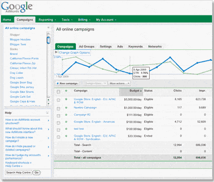
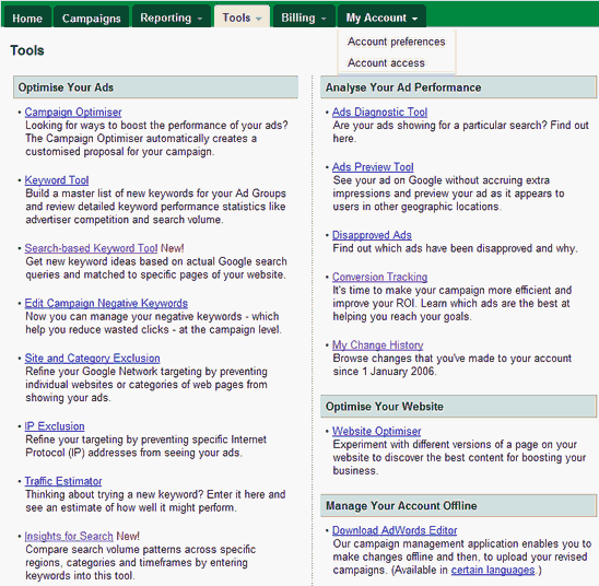
Google are renowned for their incredibly long BETA testing cycles, but it appears that the new Google AdWords interface is now more or less live.
I have to admit to being surprised by this, as our own experiences have uncovered many issues with the new system, often resulting in the interface “crashing”, kicking us out of the client’s account and back into our MCC account.
Hmmm.
Many AdWords account holders will today be greeted by an email that begins with the following:
“***Important news regarding your account***
Hello,
In the coming weeks, we’ll convert your AdWords account (Customer ID: XXX-XXX-XXXX) to a new web interface designed to make campaign management faster and easier. You can try it now; log in to your account to access the new interface immediately.
You’ll have at least 30 days from the date of this email before you’ll be required to use the new interface to manage your campaigns. During this time, well continue to release additional features and make adjustments to the new interface based on advertiser feedback.
We’re working to ensure that the new interface contains all the reports and controls that you need to manage your campaigns effectively. We won’t convert your AdWords account to the new interface until we’re confident that it will meet your advertising needs.
Before we convert your account, you can switch between the new and previous interfaces at any time. Click the “Previous Interface and “New Interface (Beta)” links in the top corner of your account (next to your email address) to switch back and forth.”
The email also lists some links to details of the new interface.
Our company has been working with the new interface for some time, and can summarise our main findings as follows.
The good:
– It’s faster. Navigating through campaigns and ad groups is quicker, and it’s easier to get a feel for what’s happening at an account, campaign or ad group level.
– It’s clearer. There are some useful performance graphs that allow you to compare two different metrics at different levels within the account.
– It’s quicker to work with. Bids and keywords can be edited “live” without having to go to a new page to do so.
The bad:
– It’s more confusing than ever before. Google have added new data, new options, new terminology and found new places to move things that will overwhelm most account holders. As a long-time believer that Google try to overwhelm their advertisers with data and options, the new system is more complicated and confusing. Good job on the confusion strategy.
– It’s unstable. There are more bugs than I would expect to see if the system were still in beta.
– It’s huge! I run my system at a rather large 1680 x 1050 resolution, and I still have to use my horizontal scrollbar in the browser for the new system. This is the only website I know that forces me to do so.
– Some of the update is little more than a “pretty” face on the old system. Go to Tools, More Tools for example, and you’ll see the same old options underneath the new nav. Why the rush?
Overall:
You judge for yourself. But I think that a lot more people are going to be wasting more money under this system.
If you’d like to know how much money your AdWords account is wasting, you may be interested in our Google AdWords Report Service.
Keep your eyes peeled, and watch where that spending is going.
Unique ideas for your business
The Demystifier puts practical ideas into your hands. You won't find them elsewhere. Original, actionable and insanely effective.


